Feature Engineering on Time-Series Data for Human Activity Recognition - Science Club

your daily dose of science and nature

Thursday, December 23, 2021

Feature Engineering on Time-Series Data for Human Activity Recognition


Transforming raw signal data of smartphone accelerometer and creating new features from it for identifying six common human activities.


    Photo by Jan Huber on Unsplash

Objective

While exploring the area of human activity recognition out of research interest, I came across several publications, research-articles and blogs. The researchers have done phenomenal work in this area and achieved state-of-the-art (SOTA) results by using some sophisticated machine learning algorithms. But most of these papers/blogs that I’ve read are either using already-engineered features or fail to provide detailed explanation on how to extract features from raw time-series data.

In this article, we will be exploring different techniques to transform the raw time-series data and extract new features from it.

The techniques that we are going to see in this article is not limited to the human activity prediction task, but can be extended to any domain involving time-series data.

About data

Smarphones and smartwatches contain tri-axial accelerometers that measure acceleration in all three spatial dimensions. These accelerometers are capable of detecting the orientation of the device, which can provide useful information for activity recognition.

The dataset that we are going to use for this demonstration is sourced from WISDM Lab, Department of Computer & Information Science, Fordham University, Bronx, NY (Link to the dataset). Note that the file that we are going to use is the raw data file — WISDM_ar_v1.1_raw.txt

This data is collected from 36 different users as they performed some common human activities such as — walking, jogging, ascending stairs, descending stairs, sitting, and standing for specific periods of time. In all cases, the data is collected every 50 millisecond, that is 20 samples per second.

There are total of 5 feature variables— ‘user’, ‘timestamp’, ‘x-axis’, ‘y-axis’, and ‘z-axis’. The target variable is ‘activity’ which we intend to predict.

‘user’ denotes the user ID, ‘timestamp’ is the unix timestamp in nanoseconds, and the rest are the accelerometer readings along the x, y, and z axes/dimensions at a given time.

Here is the glimpse of how the raw dataset looks —
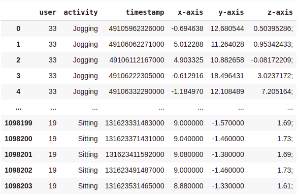
As you can see, there are over 1 Million rows and 6 columns. Also, the data needs to be cleaned and organised.

Data Cleaning and Preprocessing

We execute the following steps based on the observation —

  • drop null values.
  • change the datatype of the ‘z-axis’ column to float.
  • drop the rows where the timestamp is 0.
  • sort data in ascending order of the user and timestamp.

Here is what our data looks like after cleaning and sorting —

As you can see, we are left with 1085360 rows.

Exploratory Data Analysis

Analyzing class label distribution —

sns.set_style(“whitegrid”)
plt.figure(figsize = (10, 5))
sns.countplot(x = ‘activity’, data = df)
plt.title(‘Number of samples by activity’)
plt.show()
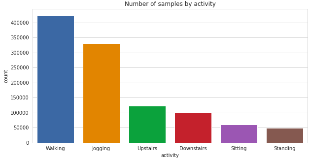
As you can see there is a significant class imbalance here with majority of the samples having class-label ‘Walking’ and ‘Jogging’. ‘Standing and ‘Sitting’ activities have least representation in the dataset.

Now let’see how the users are contributing to each activity. This will help us in deciding how to split the data for training and testing.

plt.figure(figsize = (18, 6))
sns.countplot(x = ‘user’, hue = ‘activity’, data = df)
plt.title(‘Activities by Users’)
plt.show()
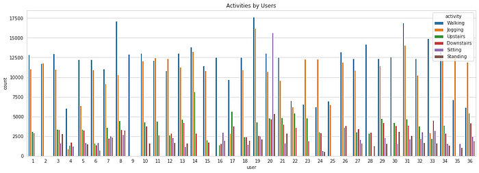
As it can be seen, not all the users are performing all the activities. The time for which they perform each activity also varies. Regardless, this won’t be affecting our subsequent analysis as we have sufficiently large number of data samples and we are assuming all the users are alike.

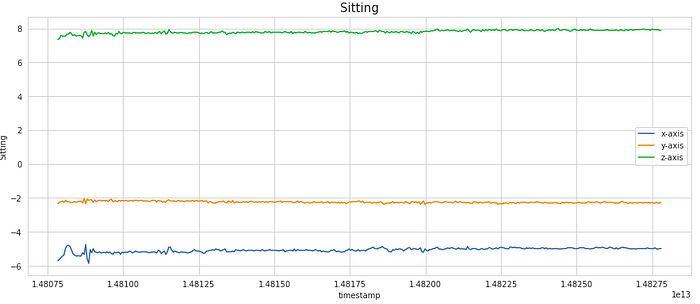
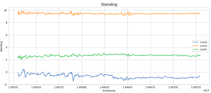
For a particular user, lets observe how the signal values in each of the x, y and z dimension varies with time.

for i in [‘Walking’, ‘Jogging’, ‘Upstairs’, ‘Downstairs’, ‘Sitting’, ‘Standing’]:
data_36 = df[(df[‘user’] == 36) & (df[‘activity’] == i)][:400]
plt.figure(figsize = (15, 6))
sns.lineplot(y = ‘x-axis’, x = ‘timestamp’, data = data_36)
sns.lineplot(y = ‘y-axis’, x = ‘timestamp’, data = data_36)
sns.lineplot(y = ‘z-axis’, x = ‘timestamp’, data = data_36)
plt.legend([‘x-axis’, ‘y-axis’, ‘z-axis’])
plt.ylabel(i)
plt.title(i, fontsize = 15)
plt.show()
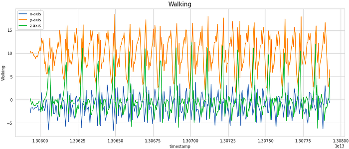
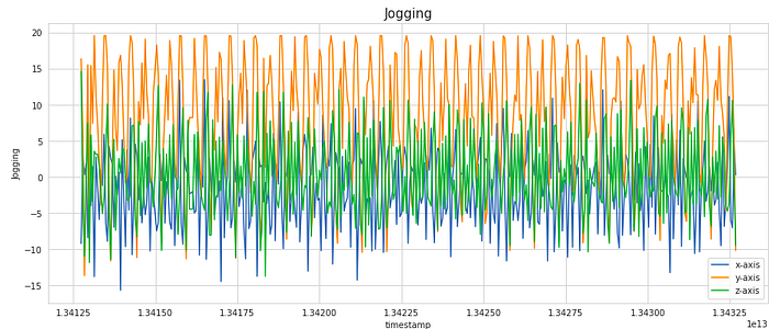
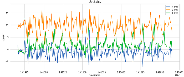
We have considered a subset of 400 samples for visualising the signal. This is equivalent to 20 secs of the activity (as the frequency of data collection was 20 Hz). As you can notice, the signals shows periodic behaviour for the activities like Walking, Jogging, Upstairs and Downstairs while it has very less movement for stagnant activities like Sitting and Standing.

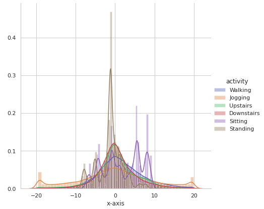
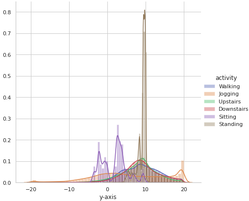
Now let’s observe activity-wise distribution of the signal data along x, y and z axes to see if there is any obvious pattern based on the range and distribution of the values.

sns.FacetGrid(df, hue = ‘activity’, size = 6).map(sns.distplot, ‘x-axis’).add_legend()
sns.FacetGrid(df, hue = ‘activity’, size = 6).map(sns.distplot, ‘y-axis’).add_legend()
sns.FacetGrid(df, hue = ‘activity’, size = 6).map(sns.distplot, ‘z-axis’).add_legend()

It is observed that there is very high overlap in the data among activities like Upstairs, Downstairs, Walking, Jogging and Standing on all the axes. Sitting somewhat appears to have distinctive values along y-axis and z-axis.

This bring us to the heart of the article, that is Data transformation and Feature engineering.

Data Transformation

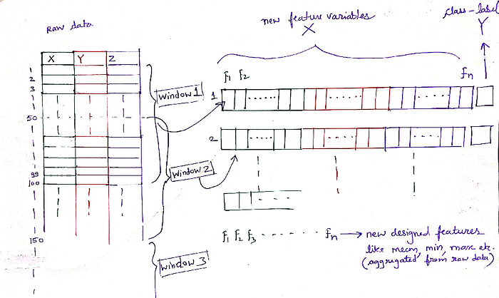
Standard classification algorithms cannot be directly applied to the raw time-series data. Instead, we must first transform the raw time-series data using ‘windowing’ technique. In this technique, we divide the data into windows of 5 seconds, and then we generate new features by aggregating the 100 raw samples contained within each of these 5 second segments. For assigning class-label against the transformed features, we take the most frequent activity in that window.

For example, let’s say a raw dataset has 100 rows of sequential data. So after windowing and aggregation (using window size = 50), it will be transformed into 2 rows. The class-label assigned for these 2 new rows will be the most frequent activity in the respective window. Likewise, for 1 million rows, we will be getting nearly a total of 20k rows in transformed set.

You must be wondering why a 5 sec window is chosen. After going through several literature, I felt that it could be the optimal window-size we can consider for capturing the repetitive motions involved in most of the six activities. Too less window-size may not capture the motion correctly, while too large window-size results in less datapoints in transformed dataset for training.

There is one more thing we can do here— instead of taking discrete windows, we take overlapping windows with 50% overlap. This ensures that every subsequent row in the transformed dataset has some information from the data in previous window as well.

All this above featurization might sound little daunting at first, but trust me, it is not that complicated. Read this section again slowly, because if you understand this well, the subsequent sections are going to be a cakewalk. Here I’m attaching this image, it will help you get a clear idea of how raw signal data is aggregated and transformed into new features.

Feature Engineering

Before we start designing new features, we must first split the data into train and test. Typically we tend to do random splitting, but here in this specific scenario, splitting as per the User ID makes more sense.

So out of total 36 users, the data of first 27 users will form our train data while rest 9 users will be included in our test data.

# train data -> Users upto User ID = 27 (i.e. 27 users)
df_train = df[df[‘user’] <= 27]
# test data -> Users from User ID = 28 to 36 (i.e. 9 users)
df_test = df[df[‘user’] > 27]

By doing this, we get about 804358 data samples in training set and 281002 samples in the test set. This is just like doing 75–25 split, but in a more sophisticated manner.

Feature Engineering Stage 1: Statistical measures

In the stage 1 of the feature engineering, we will build a total of 18 simple statistical features —
1. mean
2. standard deviation
3. average absolute deviation
4. minimum value
5. maximum value
6. difference of maximum and minimum values
7. median
8. median absolute deviation
9. interquartile range
10. negative values count
11. positive values count
12. number of values above mean
13. number of peaks
14. skewness
15. kurtosis
16. energy
17. average resultant acceleration
18. signal magnitude area

Most of these features are self-explanatory.

  • Energy of a signal in every axis is computed by taking the mean of sum of squares of the values in a window in that particular axis.
  • Average resultant acceleration over the window is computed by taking average of the square roots of the values in each of the three axis squared and added together.
  • Signal magnitude area is defined as the sum of absolute values of the three axis averaged over a window.

The below python code will give more clarity on the mathematical formulation of each of these above features.

Each of the x_list, y_list and z_list is actually a list of the windows. Each of these windows consists of 100 observations. So shall have a total of int(804358/50) -1 = 16086 windows (you can verify this is from code). X_train is our new feature dataframe built from the transformed features. Henceforth, we shall now be using this new dataframe, and progressively adding new features to it and eventually using it for training ML models.

Feature Engineering Stage 2: Fast-Fourier transform (FFT)

Fourier transform is a function that transforms a time domain signal into frequency domain. The function accepts a time signal as input and produces the frequency representation of the signal as an output. Every signal in the real world is a time signal and is made up of many sinusoids of different frequencies.

Fourier transform doesn’t change the signal. It just provides a different view to analyze your time signal because some properties and features of the signal can be fully explored in the frequency domain.

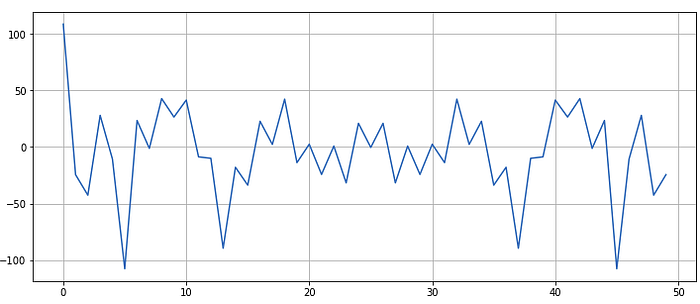
So far we have been dealing in the time domain. Let’s take any random window from our data and observe discrete Fourier transform of it —

pd.Series(np.fft.fft(pd.Series(x_list)[42])).plot()
plt.show()

Some observations—

  • The first value is unusually high. This is called as ‘DC component’ or ‘DC offset’ in electrical terminology.
  • The wave signal is symmetric about the centre.

These observations are not peculiar to this particular window, but if you take any window from our time domain data and apply FFT on top of it, you will get same observations.

Don’t bother much about the DC component, think of it as an unusually high value that we are going to discard. Also we are going to consider only first half of the signal. This will ensure that we obtain unbiased statistical features from it.

Just like Stage 1, in the Stage 2 we shall construct new features by aggregating the fourier-transformed data —

By the end of the first 2 stages of feature engineering, we now have a total of 94 features! This brings us to the Stage 3 of feature engineering.

Feature Engineering Stage 3: Capturing indices

The main goal of the feature engineering stage in any machine learning problem is to provide as much possible information to the model. More information you provide, better it learns!

So here in this case, why not take a look at index values of the underlying data as potential features?

Likewise, follow the same steps as above for transforming raw test dataframe df_test and extracting features from it to build the transformed test dataset i.e. X_test. I’m skipping this part in the article for the sake of brevity. The new X_test dataset will have int(281002/50)-1 = 5619 rows (you can verify this at your end).

This brings us to the final section of this article. Now that we have generated so many features, its time to see how well can these newly handcrafted features predict the human activity.

Implementing a Linear model for Activity Prediction

For the prediction task, we will be training a simple Logistic Regression model on the transformed train data and then evaluating the performance on transformed test data. The idea is, logistic regression being a linear classifier, it heavily relies upon the quality of the features in order to give good results. More distinctive information the features provide, better is the performance. Thus, if we are able to obtain better performance using logistic regression, then we can say that we have been successful in creating the right set of features.

Logistic Regression model

y_train = np.array(train_labels)
y_test = np.array(test_labels)

For logistic regression, it is recommended to first standardize the data.

from sklearn.preprocessing import StandardScaler
from sklearn.linear_model import LogisticRegression
from sklearn.metrics import accuracy_score
from sklearn.metrics import classification_report
# standardization
scaler = StandardScaler()
scaler.fit(X_train)
X_train_data_lr = scaler.transform(X_train)
X_test_data_lr = scaler.transform(X_test)
# logistic regression model
lr = LogisticRegression(random_state = 21)
lr.fit(X_train_data_lr, y_train)
y_pred = lr.predict(X_test_data_lr)
print("Accuracy:", accuracy_score(y_test, y_pred))
print("\n -------------Classification Report-------------\n")
print(classification_report(y_test, y_pred))

Output —

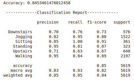
We managed to obtain overall accuracy of 84.53 % on the test data by using baseline logistic regression model on the engineered features. This is pretty good taking into consideration the fact that we just had 3 features of raw accelerometer data at the start. By using some complex classification models like tree-based ensembles, voting or stacking classifiers, there is a scope for the improvement in the accuracy and other performance metrics.

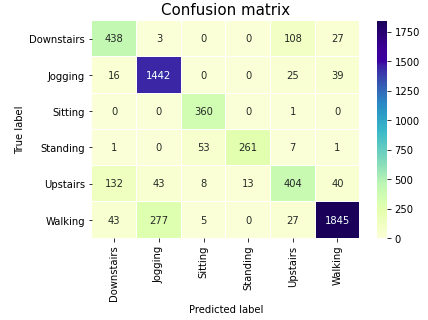
From the classification report it can be seen that the overall performance is quiet good for most of the activities. Although there is some difficulty in recognising the two stair climbing activities. This was kind of expected as these two are very similar activities. Let’s check the Confusion matrix.

labels = [‘Downstairs’, ‘Jogging’, ‘Sitting’, ‘Standing’, ‘Upstairs’, ‘Walking’]
confusion_matrix = confusion_matrix(y_test, y_pred)
sns.heatmap(confusion_matrix, xticklabels=labels, yticklabels=labels, annot=True,linewidths = 0.1, fmt=”d”, cmap = ‘YlGnBu’)
plt.title(“Confusion matrix”, fontsize = 15)
plt.ylabel(‘True label’)
plt.xlabel(‘Predicted label’)
plt.show()

From the Classification report and Confusion matrix, it can be observed that Jogging and Walking, the two most common classes in our dataset are correctly identified with good accuracy. Although there are very few samples of Sitting and Standing classes, we can still identify these activities quite well, because the two activities cause the device to change orientation and this is easily detected from the accelerometer data. To more accurately differentiate between Upstairs and Downstairs activties, the existing set of features are not enough. By coupling the tri-axial accelerometer data with the data from tri-axial gyroscope (another inertial sensor in smart devices), it can be possible to distinguish between these classes as well as recognize other activities with greater accuracy.

End Notes

We started with just 3 features — the readings of tri-axial accelerometer signal in xand z axes. We progressively engineered features from raw data and by the end, we managed to extract a total of 112 distinctive features! Later we trained a simple linear classifier and evaluated it’s performance.

As you might have realised, in order to formulate these new features, we relied upon the basic concepts from statistics and mathematics. No high-end signal processing or advanced techniques were used. Moreover, the data preparation and feature engineering techniques that we used in this article are generic and can be applied to most of the problems involving time-series data.

References

  • Jennifer R. Kwapisz, Gary M. Weiss and Samuel A. Moore (2010). Activity Recognition using Cell Phone Accelerometers, Proceedings of the Fourth International Workshop on Knowledge Discovery from Sensor Data (at KDD-10), Washington DC.
  • Davide Anguita, Alessandro Ghio, Luca Oneto, Xavier Parra and Jorge L. Reyes-Ortiz. A Public Domain Dataset for Human Activity Recognition Using Smartphones. 21th European Symposium on Artificial Neural Networks, Computational Intelligence and Machine Learning, ESANN 2013.


Transforming raw signal data of smartphone accelerometer and creating new features from it for identifying six common human activities.


    Photo by Jan Huber on Unsplash

Objective

While exploring the area of human activity recognition out of research interest, I came across several publications, research-articles and blogs. The researchers have done phenomenal work in this area and achieved state-of-the-art (SOTA) results by using some sophisticated machine learning algorithms. But most of these papers/blogs that I’ve read are either using already-engineered features or fail to provide detailed explanation on how to extract features from raw time-series data.

In this article, we will be exploring different techniques to transform the raw time-series data and extract new features from it.

The techniques that we are going to see in this article is not limited to the human activity prediction task, but can be extended to any domain involving time-series data.

About data

Smarphones and smartwatches contain tri-axial accelerometers that measure acceleration in all three spatial dimensions. These accelerometers are capable of detecting the orientation of the device, which can provide useful information for activity recognition.

The dataset that we are going to use for this demonstration is sourced from WISDM Lab, Department of Computer & Information Science, Fordham University, Bronx, NY (Link to the dataset). Note that the file that we are going to use is the raw data file — WISDM_ar_v1.1_raw.txt

This data is collected from 36 different users as they performed some common human activities such as — walking, jogging, ascending stairs, descending stairs, sitting, and standing for specific periods of time. In all cases, the data is collected every 50 millisecond, that is 20 samples per second.

There are total of 5 feature variables— ‘user’, ‘timestamp’, ‘x-axis’, ‘y-axis’, and ‘z-axis’. The target variable is ‘activity’ which we intend to predict.

‘user’ denotes the user ID, ‘timestamp’ is the unix timestamp in nanoseconds, and the rest are the accelerometer readings along the x, y, and z axes/dimensions at a given time.

Here is the glimpse of how the raw dataset looks —

As you can see, there are over 1 Million rows and 6 columns. Also, the data needs to be cleaned and organised.

Data Cleaning and Preprocessing

We execute the following steps based on the observation —

  • drop null values.
  • change the datatype of the ‘z-axis’ column to float.
  • drop the rows where the timestamp is 0.
  • sort data in ascending order of the user and timestamp.

Here is what our data looks like after cleaning and sorting —

As you can see, we are left with 1085360 rows.

Exploratory Data Analysis

Analyzing class label distribution —

sns.set_style(“whitegrid”)
plt.figure(figsize = (10, 5))
sns.countplot(x = ‘activity’, data = df)
plt.title(‘Number of samples by activity’)
plt.show()

As you can see there is a significant class imbalance here with majority of the samples having class-label ‘Walking’ and ‘Jogging’. ‘Standing and ‘Sitting’ activities have least representation in the dataset.

Now let’see how the users are contributing to each activity. This will help us in deciding how to split the data for training and testing.

plt.figure(figsize = (18, 6))
sns.countplot(x = ‘user’, hue = ‘activity’, data = df)
plt.title(‘Activities by Users’)
plt.show()

As it can be seen, not all the users are performing all the activities. The time for which they perform each activity also varies. Regardless, this won’t be affecting our subsequent analysis as we have sufficiently large number of data samples and we are assuming all the users are alike.

For a particular user, lets observe how the signal values in each of the x, y and z dimension varies with time.

for i in [‘Walking’, ‘Jogging’, ‘Upstairs’, ‘Downstairs’, ‘Sitting’, ‘Standing’]:
data_36 = df[(df[‘user’] == 36) & (df[‘activity’] == i)][:400]
plt.figure(figsize = (15, 6))
sns.lineplot(y = ‘x-axis’, x = ‘timestamp’, data = data_36)
sns.lineplot(y = ‘y-axis’, x = ‘timestamp’, data = data_36)
sns.lineplot(y = ‘z-axis’, x = ‘timestamp’, data = data_36)
plt.legend([‘x-axis’, ‘y-axis’, ‘z-axis’])
plt.ylabel(i)
plt.title(i, fontsize = 15)
plt.show()
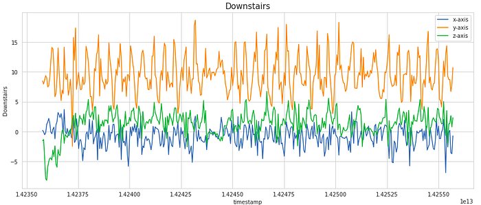
We have considered a subset of 400 samples for visualising the signal. This is equivalent to 20 secs of the activity (as the frequency of data collection was 20 Hz). As you can notice, the signals shows periodic behaviour for the activities like Walking, Jogging, Upstairs and Downstairs while it has very less movement for stagnant activities like Sitting and Standing.

Now let’s observe activity-wise distribution of the signal data along x, y and z axes to see if there is any obvious pattern based on the range and distribution of the values.

sns.FacetGrid(df, hue = ‘activity’, size = 6).map(sns.distplot, ‘x-axis’).add_legend()
sns.FacetGrid(df, hue = ‘activity’, size = 6).map(sns.distplot, ‘y-axis’).add_legend()
sns.FacetGrid(df, hue = ‘activity’, size = 6).map(sns.distplot, ‘z-axis’).add_legend()
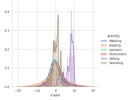
It is observed that there is very high overlap in the data among activities like Upstairs, Downstairs, Walking, Jogging and Standing on all the axes. Sitting somewhat appears to have distinctive values along y-axis and z-axis.

This bring us to the heart of the article, that is Data transformation and Feature engineering.

Data Transformation

Standard classification algorithms cannot be directly applied to the raw time-series data. Instead, we must first transform the raw time-series data using ‘windowing’ technique. In this technique, we divide the data into windows of 5 seconds, and then we generate new features by aggregating the 100 raw samples contained within each of these 5 second segments. For assigning class-label against the transformed features, we take the most frequent activity in that window.

For example, let’s say a raw dataset has 100 rows of sequential data. So after windowing and aggregation (using window size = 50), it will be transformed into 2 rows. The class-label assigned for these 2 new rows will be the most frequent activity in the respective window. Likewise, for 1 million rows, we will be getting nearly a total of 20k rows in transformed set.

You must be wondering why a 5 sec window is chosen. After going through several literature, I felt that it could be the optimal window-size we can consider for capturing the repetitive motions involved in most of the six activities. Too less window-size may not capture the motion correctly, while too large window-size results in less datapoints in transformed dataset for training.

There is one more thing we can do here— instead of taking discrete windows, we take overlapping windows with 50% overlap. This ensures that every subsequent row in the transformed dataset has some information from the data in previous window as well.

All this above featurization might sound little daunting at first, but trust me, it is not that complicated. Read this section again slowly, because if you understand this well, the subsequent sections are going to be a cakewalk. Here I’m attaching this image, it will help you get a clear idea of how raw signal data is aggregated and transformed into new features.
Feature Engineering

Before we start designing new features, we must first split the data into train and test. Typically we tend to do random splitting, but here in this specific scenario, splitting as per the User ID makes more sense.

So out of total 36 users, the data of first 27 users will form our train data while rest 9 users will be included in our test data.

# train data -> Users upto User ID = 27 (i.e. 27 users)
df_train = df[df[‘user’] <= 27]
# test data -> Users from User ID = 28 to 36 (i.e. 9 users)
df_test = df[df[‘user’] > 27]

By doing this, we get about 804358 data samples in training set and 281002 samples in the test set. This is just like doing 75–25 split, but in a more sophisticated manner.

Feature Engineering Stage 1: Statistical measures

In the stage 1 of the feature engineering, we will build a total of 18 simple statistical features —
1. mean
2. standard deviation
3. average absolute deviation
4. minimum value
5. maximum value
6. difference of maximum and minimum values
7. median
8. median absolute deviation
9. interquartile range
10. negative values count
11. positive values count
12. number of values above mean
13. number of peaks
14. skewness
15. kurtosis
16. energy
17. average resultant acceleration
18. signal magnitude area

Most of these features are self-explanatory.

  • Energy of a signal in every axis is computed by taking the mean of sum of squares of the values in a window in that particular axis.
  • Average resultant acceleration over the window is computed by taking average of the square roots of the values in each of the three axis squared and added together.
  • Signal magnitude area is defined as the sum of absolute values of the three axis averaged over a window.

The below python code will give more clarity on the mathematical formulation of each of these above features.

Each of the x_list, y_list and z_list is actually a list of the windows. Each of these windows consists of 100 observations. So shall have a total of int(804358/50) -1 = 16086 windows (you can verify this is from code). X_train is our new feature dataframe built from the transformed features. Henceforth, we shall now be using this new dataframe, and progressively adding new features to it and eventually using it for training ML models.

Feature Engineering Stage 2: Fast-Fourier transform (FFT)

Fourier transform is a function that transforms a time domain signal into frequency domain. The function accepts a time signal as input and produces the frequency representation of the signal as an output. Every signal in the real world is a time signal and is made up of many sinusoids of different frequencies.

Fourier transform doesn’t change the signal. It just provides a different view to analyze your time signal because some properties and features of the signal can be fully explored in the frequency domain.

So far we have been dealing in the time domain. Let’s take any random window from our data and observe discrete Fourier transform of it —

pd.Series(np.fft.fft(pd.Series(x_list)[42])).plot()
plt.show()
Some observations—

  • The first value is unusually high. This is called as ‘DC component’ or ‘DC offset’ in electrical terminology.
  • The wave signal is symmetric about the centre.

These observations are not peculiar to this particular window, but if you take any window from our time domain data and apply FFT on top of it, you will get same observations.

Don’t bother much about the DC component, think of it as an unusually high value that we are going to discard. Also we are going to consider only first half of the signal. This will ensure that we obtain unbiased statistical features from it.

Just like Stage 1, in the Stage 2 we shall construct new features by aggregating the fourier-transformed data —

By the end of the first 2 stages of feature engineering, we now have a total of 94 features! This brings us to the Stage 3 of feature engineering.

Feature Engineering Stage 3: Capturing indices

The main goal of the feature engineering stage in any machine learning problem is to provide as much possible information to the model. More information you provide, better it learns!

So here in this case, why not take a look at index values of the underlying data as potential features?

Likewise, follow the same steps as above for transforming raw test dataframe df_test and extracting features from it to build the transformed test dataset i.e. X_test. I’m skipping this part in the article for the sake of brevity. The new X_test dataset will have int(281002/50)-1 = 5619 rows (you can verify this at your end).

This brings us to the final section of this article. Now that we have generated so many features, its time to see how well can these newly handcrafted features predict the human activity.

Implementing a Linear model for Activity Prediction

For the prediction task, we will be training a simple Logistic Regression model on the transformed train data and then evaluating the performance on transformed test data. The idea is, logistic regression being a linear classifier, it heavily relies upon the quality of the features in order to give good results. More distinctive information the features provide, better is the performance. Thus, if we are able to obtain better performance using logistic regression, then we can say that we have been successful in creating the right set of features.

Logistic Regression model

y_train = np.array(train_labels)
y_test = np.array(test_labels)

For logistic regression, it is recommended to first standardize the data.

from sklearn.preprocessing import StandardScaler
from sklearn.linear_model import LogisticRegression
from sklearn.metrics import accuracy_score
from sklearn.metrics import classification_report
# standardization
scaler = StandardScaler()
scaler.fit(X_train)
X_train_data_lr = scaler.transform(X_train)
X_test_data_lr = scaler.transform(X_test)
# logistic regression model
lr = LogisticRegression(random_state = 21)
lr.fit(X_train_data_lr, y_train)
y_pred = lr.predict(X_test_data_lr)
print("Accuracy:", accuracy_score(y_test, y_pred))
print("\n -------------Classification Report-------------\n")
print(classification_report(y_test, y_pred))

Output —
We managed to obtain overall accuracy of 84.53 % on the test data by using baseline logistic regression model on the engineered features. This is pretty good taking into consideration the fact that we just had 3 features of raw accelerometer data at the start. By using some complex classification models like tree-based ensembles, voting or stacking classifiers, there is a scope for the improvement in the accuracy and other performance metrics.

From the classification report it can be seen that the overall performance is quiet good for most of the activities. Although there is some difficulty in recognising the two stair climbing activities. This was kind of expected as these two are very similar activities. Let’s check the Confusion matrix.

labels = [‘Downstairs’, ‘Jogging’, ‘Sitting’, ‘Standing’, ‘Upstairs’, ‘Walking’]
confusion_matrix = confusion_matrix(y_test, y_pred)
sns.heatmap(confusion_matrix, xticklabels=labels, yticklabels=labels, annot=True,linewidths = 0.1, fmt=”d”, cmap = ‘YlGnBu’)
plt.title(“Confusion matrix”, fontsize = 15)
plt.ylabel(‘True label’)
plt.xlabel(‘Predicted label’)
plt.show()
From the Classification report and Confusion matrix, it can be observed that Jogging and Walking, the two most common classes in our dataset are correctly identified with good accuracy. Although there are very few samples of Sitting and Standing classes, we can still identify these activities quite well, because the two activities cause the device to change orientation and this is easily detected from the accelerometer data. To more accurately differentiate between Upstairs and Downstairs activties, the existing set of features are not enough. By coupling the tri-axial accelerometer data with the data from tri-axial gyroscope (another inertial sensor in smart devices), it can be possible to distinguish between these classes as well as recognize other activities with greater accuracy.

End Notes

We started with just 3 features — the readings of tri-axial accelerometer signal in xand z axes. We progressively engineered features from raw data and by the end, we managed to extract a total of 112 distinctive features! Later we trained a simple linear classifier and evaluated it’s performance.

As you might have realised, in order to formulate these new features, we relied upon the basic concepts from statistics and mathematics. No high-end signal processing or advanced techniques were used. Moreover, the data preparation and feature engineering techniques that we used in this article are generic and can be applied to most of the problems involving time-series data.

References

  • Jennifer R. Kwapisz, Gary M. Weiss and Samuel A. Moore (2010). Activity Recognition using Cell Phone Accelerometers, Proceedings of the Fourth International Workshop on Knowledge Discovery from Sensor Data (at KDD-10), Washington DC.
  • Davide Anguita, Alessandro Ghio, Luca Oneto, Xavier Parra and Jorge L. Reyes-Ortiz. A Public Domain Dataset for Human Activity Recognition Using Smartphones. 21th European Symposium on Artificial Neural Networks, Computational Intelligence and Machine Learning, ESANN 2013.

No comments:

Post a Comment